In the digital age, the way we access information has drastically changed. With a plethora of devices at our disposal, it’s crucial for websites to adapt to varying screen sizes and resolutions. This is where responsive design comes into play. But what exactly is responsive design, and why is it so important in today’s digital landscape?
Understanding the Concept of Responsive Design
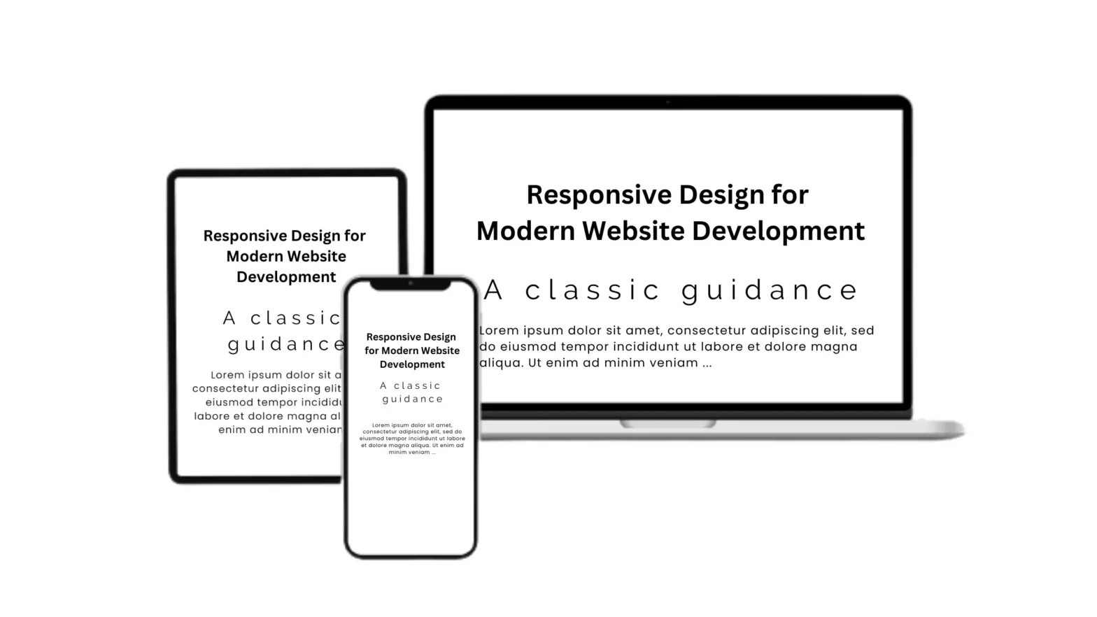
Responsive design is a web design approach that ensures your website looks good on all devices, from desktops to mobile phones. It automatically adjusts the layout of your website based on the screen size and orientation of the device being used to view it. This concept is not just about aesthetics; it’s about providing a seamless and efficient user experience regardless of how your site is accessed. This is a key aspect of website design and development.
The Evolution of Responsive Design
The concept of responsive design was first introduced by Ethan Marcotte in 2010. Since then, it has become a standard practice in web development, with many businesses recognizing its importance in delivering a seamless user experience. In fact, a study by A. Hussain and Emmanuel O. C. Mkpojiogu found that responsive web design significantly impacts user experience across different devices.

Why Responsive Design is Crucial in Today's Digital Landscape
In today’s digital landscape, users expect a seamless online experience, regardless of the device they’re using. Responsive design ensures that your website looks and functions perfectly on all devices, enhancing user satisfaction and engagement. A research paper by Moh Dani Ariawan, Agung Triayudi, and Ira Diana Sholihati emphasized the importance of the Human-Centered Design Method in responsive web design. This method focuses on the user’s needs and habits, making the website more accessible and responsive when accessed via mobile. This is a crucial ingredient for successful websites.
The Technical Aspects of Responsive Design
Responsive design is more than just a design philosophy; it’s a set of technical practices that enable websites to adapt to different screen sizes. These practices include fluid grids, flexible images, and media queries.
Fluid Grids: The Backbone of Responsive Design
Fluid grids are a key component of responsive design. They use relative units like percentages, rather than absolute units like pixels, to define the width of each element on the page. This allows the layout to adjust fluidly as the screen size changes.
Flexible Images: Keeping Visuals Intact
Flexible images are another crucial aspect of responsive design. They automatically resize themselves based on the screen size, ensuring that your visuals always look their best.
Media Queries: Adapting to Different Screen Sizes
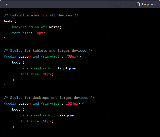
Media queries are a CSS technique that allows you to apply different styles for different devices. They enable you to adjust the layout, font size, and other design elements based on the characteristics of the device being used.
In the adjoining example, the default styles apply to all devices. However, when the screen width is 768 pixels or larger (typical for tablets), the background color changes to light gray and the font size increases to 18 pixels. When the screen width is 1024 pixels or larger (typical for desktops), the background color changes to dark gray and the font size increases to 20 pixels. This is a simple demonstration of how media queries can be used to adapt the layout and design elements of a webpage based on the characteristics of the device being used.
The Benefits of Implementing Responsive Design
Implementing responsive design comes with a host of benefits, from improved user experience to better SEO performance.
Improved User Experience
A responsive website provides a seamless user experience, as it eliminates the need for users to resize, pan, or scroll horizontally to view content. This leads to increased user satisfaction and engagement. A study by B. A. Zardari, Z. Hussain, and others found that satisfaction, perceived ease of use, perceived usefulness, information quality, self-efficacy, social influence, and benefits have a statistically significant effect on the behavioral intention of the students regarding the acceptance of the e-learning portal. This study can be related to the importance of responsive design in e-learning platforms, where the user experience is crucial for the acceptance and success of the platform.
Increased Mobile Traffic
With the rise of mobile internet usage, having a responsive website can significantly increase your mobile traffic. As your website becomes accessible and user-friendly on all devices, you’re likely to attract a wider audience. This is where the concept of mobile-first website development comes into play.
Faster Website Development
Responsive design can speed up the web development process. Instead of creating separate websites for different devices, you can create one website that works seamlessly across all platforms.
Better SEO Performance
Responsive design is also beneficial for SEO. Google recommends responsive design as a best practice, as it makes it easier for Google to crawl and index your content. Furthermore, a responsive website can lead to lower bounce rates and higher conversion rates, improving your website’s overall SEO performance.
Lower Bounce Rates
A responsive website can significantly reduce your bounce rate. When users visit a website that doesn’t display properly on their device, they’re likely to leave, increasing the website’s bounce rate. A responsive design ensures that all users have a positive experience, reducing the likelihood of them leaving prematurely.
Higher Conversion Rates
A responsive website can also lead to higher conversion rates. When users have a positive experience on your website, they’re more likely to engage with your content and take desired actions, such as making a purchase or signing up for a newsletter.
Conclusion: The Future of Responsive Design
Responsive design is not just a trend; it’s the future of web development. As the digital landscape continues to evolve, the need for websites to be accessible and user-friendly on all devices will only increase. By implementing responsive design, you can ensure that your website is prepared for the future of digital consumption. A research paper by Dimas Sasongko discussed the importance of responsive web design and user experience in digital libraries. The study found that implementing responsive web design and user experience in digital library interfaces can improve the estimated percentage of success and task time users.
FAQs
What is responsive design?
Why is responsive design important?
What are the key components of responsive design?
How does responsive design benefit SEO?
What is the future of responsive design?

Written By- Lucas Samuel
PROJECT MANAGER
Digital Strategist | SEO Analyst | Website Analytics Expert
10+years experience in digital marketing Industry